CSF
MOTORCYCLE
CLIENT-
Colt Shane Fulk Motorcycle LTD
SCOPE-
Logo Design
Pattern Design
Graphic Design


BRIEF
I had the privilege of taking on a project with an Arizona motorcycle company, aiming to redefine its graphic style. The company's essence revolves around modernity, fun, and a departure from traditional motorcycle aesthetics. They tasked me with creating an all-over print for shirts, bags, and other merchandise that not only spoke the language of motorcycle culture but also echoed Arizona's captivating landscapes. A significant challenge was to fuse these elements while staying true to the company's core values, reflected in a cohesive color palette.
ACTION
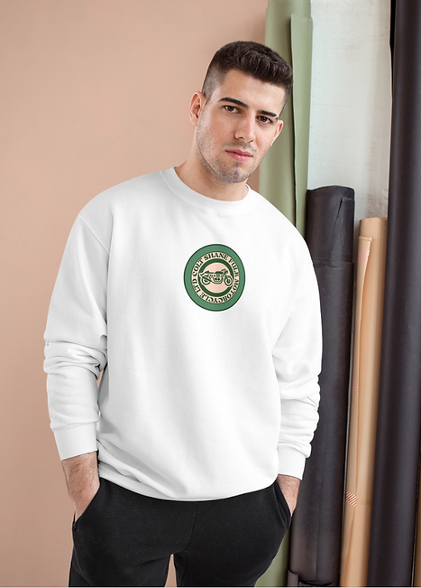
To fulfill the brief, beginning from scratch in Photoshop, I hand-drew the all-over print, choosing elements that represent the brand. Drawing inspiration from motorcycle adventure and Arizona's landscapes, I arranged the elements into a half-drop pattern for versatility. The color palette was curated to evoke the vibrant energy of motorcycle culture. Transitioning to Adobe Illustrator, I then designed a range of graphics, including the brand logo and visuals for posters, postcards, and Instagram. Each design maintained consistency with the colour palette and brand essence.
OUTCOME

ALL OVER PRINT DESIGN
I designed an all-over repeat print for the project, creating two distinct colorways. To encapsulate both the motorcycle brand and the essence of Arizona, I handpicked elements that symbolized these themes. Contrary to the conventional motorbike company style, I aimed for a unique look and color palette that stood in contrast. Employing Photoshop, I sketched and designed all elements before arranging them into a repeat tile, creating a half-drop repeat pattern for a seamless effect. The versatility of a repeat print was a key selling point, as it could be used across a multitude of applications, enhancing its value for the company's marketing efforts.


BRAND LOGO DESIGN

PROMOTION POSTER DESIGN


MERCHANDISE DESIGN


